
Yext
2026
Turning Data Overload into AI-driven Actions
Designed the Action Center, a single hub that turns billions of search signals into a prioritized, actionable checklist.
The Context
A powerful tool that users did not know how to use.
Scout was developed to give businesses deep insight into search performance by ingesting billions of signals across locations, keywords, and competitors. As the product matured, a pattern emerged in customer feedback: users trusted the data, but they didn't know how to act on it, and some were leaving because of it.
Yext needed Scout to evolve from a reporting layer into a product that drove measurable outcomes — and to do so quickly within a competitive AI search landscape.
The Problem
Data wasn't the gap—direction was.
Customer feedback consistently highlighted the same issue: "This data is great, but what should I actually do first?" Scout's two performance scores gave users a sense of their status but offered no path to improvement. This led to analytics fatigue; users would log in, absorb the info, and log out without taking any meaningful action. Each persona that logged into our product needed something specific:
Marketing Manager
Needs high-level keyword trends and competitive landscape insights to adjust overall strategy.
Local Manager
Focuses on granular location-based signals to improve specific branch visibility and engagement.
Executive
Requires summarized performance scores and ROI metrics for quarterly reviews and budgeting.
The Process
Using data to build agents.
Working closely with engineering, we analyzed core performance metrics to build structured playbooks that empower agents to create actions. Through iterative testing loops, we fine-tuned system prompts and outputs until reaching peak reliability.

The Workflow Decision
Adapting how we designed.
Figma used for: Blueprint and alignment
The initial 0-to-1 vision, design system logic, and early stakeholder alignment on layout. Figma remained essential for establishing the frame, but it ceased to be the primary tool for iteration.

Claude used for: Strategy and speed
Because Scout's AI capabilities were evolving weekly, static mockups could not keep up. Claude allowed me to ideate, pressure-test against real data states, and drive strategic conversations faster than pixel-perfect screens ever permitted.
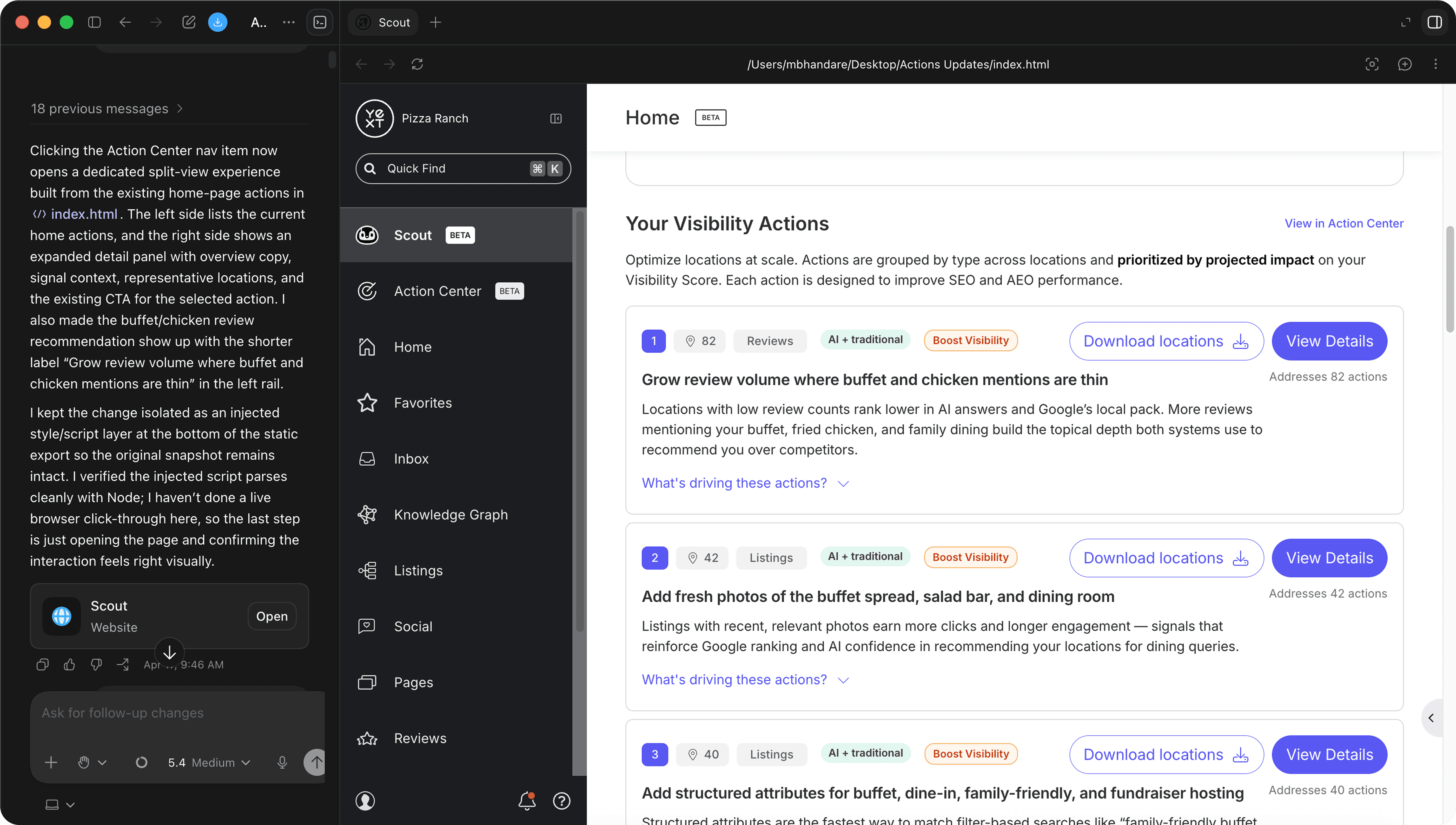
What this unlocked:
Prototyping in code removed the translation gap between design intent and engineering reality. Edge cases, latency states, and dynamic AI outputs that were once faked in Figma became real constraints to design around early, reducing revision cycles after handoff.
The Iterations
From two scores to one clear next step.
The first version of the home page asked users to interpret two scores and then decide what to do. Over four rounds, we moved the page from explaining performance to telling users what to do next, merging the scores, simplifying how users narrowed down their options, and making each action explain itself.
Two scores, three strategies
We placed an Optimization score beside the Visibility score and asked users to pick a strategy (Improve Visibility, Improve Optimization, or Target a competitor) before seeing recommendations as a card grid. What we learned: The two scores competed for attention, and users weren't sure which one to improve. The grid made every action look equally important.
Optimization becomes progress
We reframed optimization as actions completed (37 of 76) so it measured effort rather than handing out a grade. "Target a competitor" became a full action plan built against one rival. What we learned: Showing progress worked better than a grade, but choosing a strategy still added a step before users saw anything useful.
Actions get their own home
Actions moved into a dedicated panel with a completion gauge and category totals. Familiar filters (Domain, Impact, Competitor) replaced the strategy chips. What we learned: Filters were faster than strategies, but "78 of 200 completed" felt like a backlog. It framed the work as debt instead of opportunity.
What changed across rounds
Two scores → one score. Choosing a strategy → filtering. Grading the user → showing the next step. Equal cards → a prioritized list with reasons.
The Solution
Introducing Agentic Actions
The final redesign focused on improving clarity across everyday financial tasks through stronger hierarchy, simplified navigation, and more contextual transaction feedback. The updated interface made balances easier to compare, actions easier to locate, and activity flows easier to understand at a glance.
The Impact
By shifting from observation to execution, we unlocked significant market growth and redefined our long-term objectives. This evolution empowered our users to act decisively, resulting in stronger retention and a new strategic vision for our tool.
$6.8M+
ACV Secured
48%
Session Growth

